Switch (OLED model) - Review
The Nintendo Switch has become one of my favourite gaming platforms, it offers up not only some of the best Nintendo made games, but has become a home for some amazing games from other developers – large and small, but as the next generation of consoles kicked off last year, it has started to feel a little stretched in its performance. While the OLED model doesn’t increase the power underneath, it does repackage it, but is that enough?
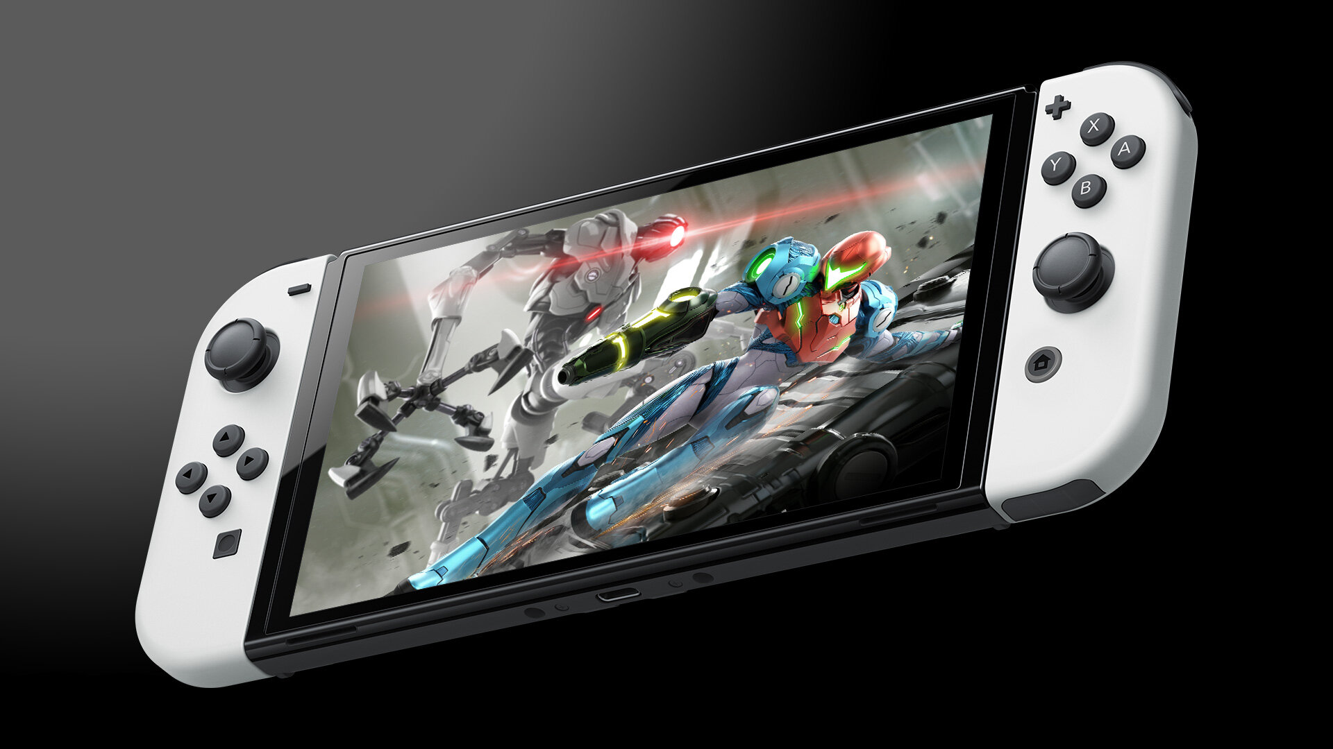
The new Switch (OLED model) if we write the name out as Nintendo do, is more than just a new screen on the same base, there are a host of improvements to the hardware that make things better across the board, but as I said above, there is now increase in overall power it offers. So, leaving that aside, what does the new model offer, well an OLED screen for one, which is a given as its in the name, but there are also improvements to the speakers, stand, button and fan placement, along with a few smaller changes, so lets start with the big one, the screen.
OLED is an acronym for organic light-emitting diode and is different from standard LCD panels, of which the Switch and Switch Lite offer, as it has no need for any backlighting panel, which allows for richer colours, but also better power management. The colour gamut is going to be the major draw here for gamers who prefer to play in portable mode and easily evokes memories of the launch PlayStation Vita, which also sported an OLED screen, something they removed in later revisions to cut costs though. From the moment you boot up the console and set it up, the screen is much clearer, providing a crisper image that is not as harsh on the eyes, compared to the original Switch model. Even the brightness of the screen is better and while it does seem like it is a little darker, that is due to the lack of additional backlight, meaning that its not boosted, unlike the LCD display on the Switch. What all this boils down to is that the image you see on the OLED is more accurate to what it should be, much like viewing something in real-life, as opposed to a photo of something.
The screen being OLED is not the only change, it is now also slightly larger, going from the 6.2 inches to 7 inches, or 15.7cm to 17.7cm, and while 2cm may not sound like a lot, given that the overall dimensions are almost identical, that means that the bezels around the around the display have been shrunk to accommodate the larger display. When the system is not powered up, it can be quite difficult to spot the screen amongst the bezels, given how small they are and the screen itself, whereas on the original model, it is beyond simple to see the two. The smaller bezel also has an added benefit you might not have considered, less reflections to deal with, because when the screen is on, you can just enjoy the image, whereas the original model has lots of shiny black border to reflect everything around you.
Speaking of reflections, we do have to address the downside with the new OLED model, the entire main body is reflective, so while you won’t see anything on the screen when its in use, light will bounce off the shell, something the original doesn’t have to worry about with its matte finish. While we are on the subject of the body, the back of the OLED model is actually better than the original, in that it has a slight textured effect to it, so if you are like me and your fingers reach beyond the confines of the Joy-Cons, you won’t have to worry about it feeling slippery. The rest of the body, which is made up of the Joy-Cons will feel just the same as they do on your regular Switch, they are the same size and dimensions.
There is however one major improvement to the rear of the OLED model and that is the kickstand, on the original Switch it is small, flimsy and near impossible to get away from the main body, without feeling like you are about to break it. The flip side to that is once it is away from the main body, the slightest force can see it pull away and come loose, which is ok as it was designed with that in mind, but still, it can get lost if you don’t pay attention to it. The new kickstand is one that sees a lot with the Surface line of products, meaning that it covers the length of the body and more importantly has more than one position when open. The new stand can be adjusted to allowed for almost any angle, once you have it out and much like the Surface product, is using a two-level hinge to achieve the result. Getting the kickstand out can be a little awkward, as there is no space to pull it away from the main body, when its closed, there are no grip points to use, as its smooth. Instead the only space where the kickstand has clearance to get access to pull it out, is along where the newly relocated vents are found and while you can just pull your finger along the kickstand to pull it loose, if you use a nail, you might damage the grill that covers the vent.
The relocated vents on the OLED are now pointing down from the main body, compared to them pointing back on the original Switch, so airflow is a little better around the rear of the device, the top is much the same, at least for the vent. The space and size of vent is much the same, just the shape of the plastic around has changed, instead of being five fairly large holes, it is now a dozen narrow slots, which should help keep dust out. Sticking on the top of the body, the game card cover is now worse than the original, which wasn’t the best to begin with. Originally there was a large grove for you to get your finger, nail or something under to pop the cover up, now though that has been replaced with one that runs the length of the cover and is slim as heck by comparison. The only other change, these ones for the better, are regarding the volume and power buttons, they are now longer, giving you more button to touch upon, which can help greatly when you want to adjust things, without taking your eyes of the screen.
The largest improvement that no-one is talking about, included Nintendo are the redesigned speakers, they are now larger and better placed and offer a much clearer and deeper sound than before. On the original Switch and even the Lite, they are small little slots on the front of the console, that point towards the player, which does provide a nice amount of sound, but if you hold the Switch to close to yourself while playing, the sound can be stuck bouncing off you and back into the console. On the OLED model, not only are the speaker holes larger, by a little more than double in length, they are now on the edge of the console, meaning they point down more than anything, which in turn provides some clearer sounds. This is not the same as the PlayStation 5’s spatial audio or the Xbox and their use of Dolby Atmos, but now the sound comes through loud and clear, without having to pump the volume up to insane levels. Those who are looking for headphones can still find the jack on the top of the console, in the same spot as always.
The new dock is also, well new, but if you are getting the Switch OLED model, there is a fair chance you are not likely to dock it anytime soon, not to say that you won’t but it takes away the consoles shiny new display. When you do though, there are some big changes to the dock that are important to note, first is that there is now an in-built LAN adaptor, which for those folks who preferred a corded network connection, it means you now can, without the need for an extra adaptor, the downside is though that you lose a USB port from the back. You still retain the two external USB’s, so charging of devices is still possible, however if you are someone like me and are fine with wireless gaming, the lack of the rear USB may cause you to reconfigure somethings. The dock has a smoother finish than the original, with the front feeling somewhat softer, even though it is still a hard plastic and of course the rounded top makes it look smaller, though it isn’t. One thing to be aware of, the USB-C connection in the dock, where it connects to your Switch is now inside a mechanism that only exposes the plug, when the Switch goes in, so it will take a little extra push to get it to connect.
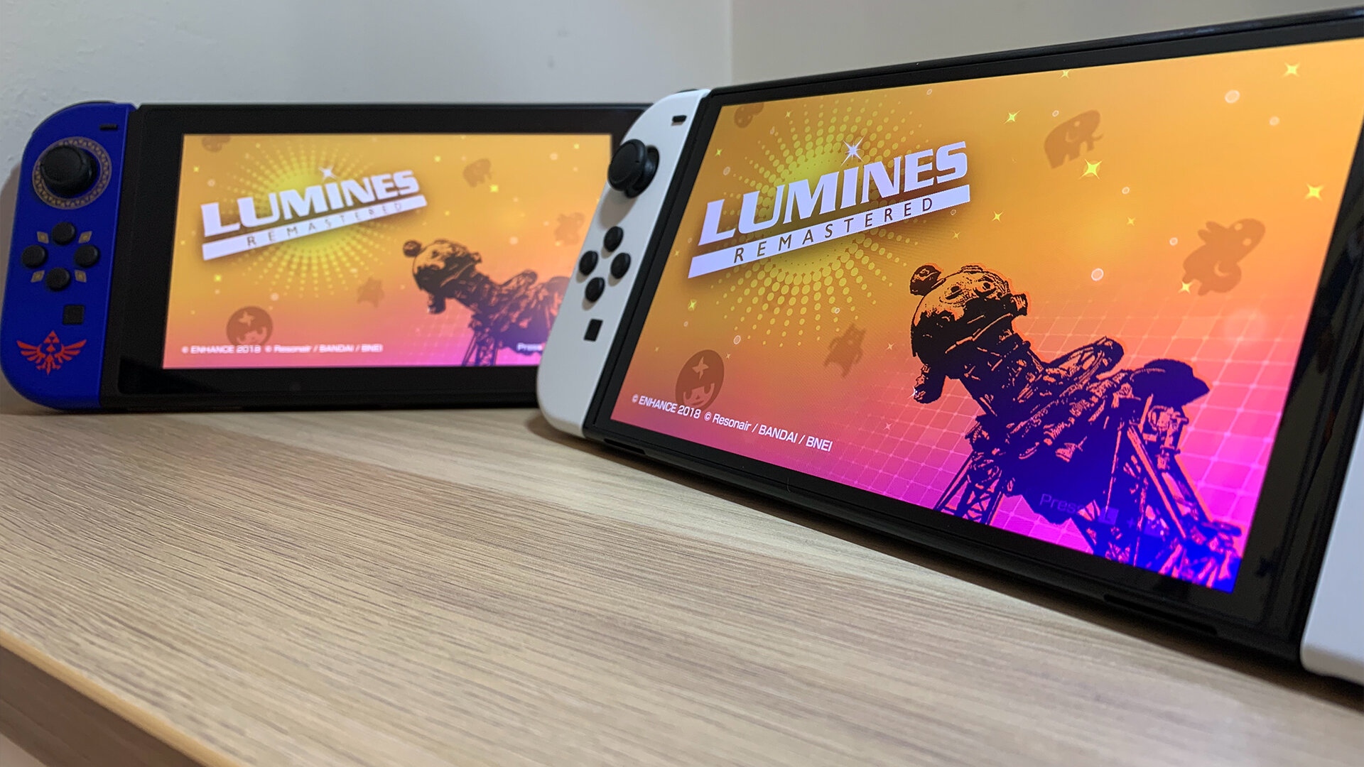
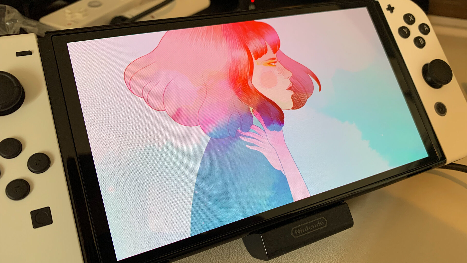
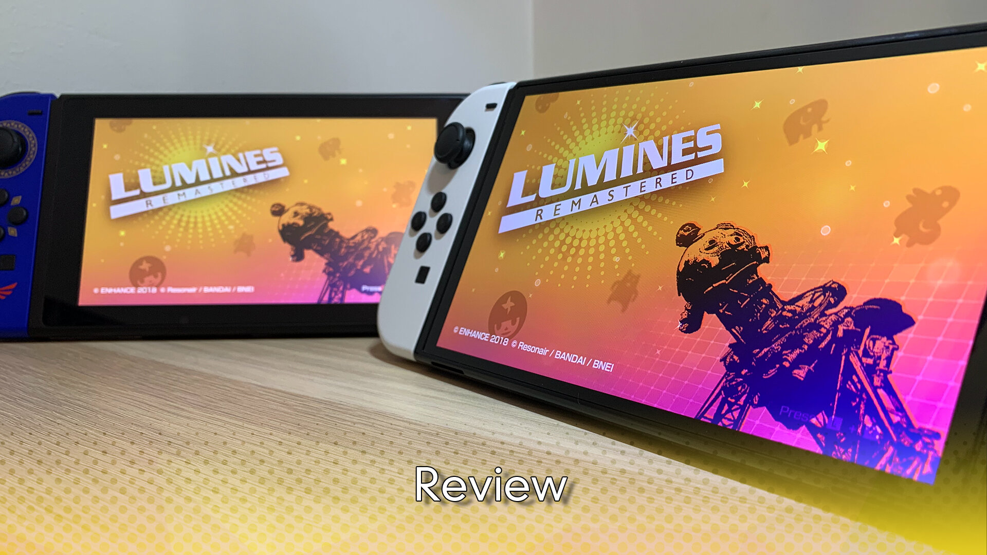
All that above is well and good, but the question remains, how do the games look on the Switch (OLED model) and the simple answer is damn good, the more complicated answer is, it varies. One of the first games I downloaded to the OLED model was Lumines, a game that go its start on the PlayStation Portable, but since has come to almost everything, part puzzler and part music game, it is one I can play for hours at a time. When the game hit Vita, it was a stunning success, pun intended, because the OLED screen there made everything pop and the remaster on Switch is much the same. Combined with the new speakers, everything looked and sounded great in handheld mode, which was what I was hoping for. Nintendo’s biggest Switch game, Mario Kart 8 Deluxe also looks amazing and given that is a port of a Wii U game, is saying something, again like Lumines, the screen really helps those colours pop. Monster Hunter Rise is one of a very few number of games that have been scored 10 out of 10 here and it too looks amazing on the OLED model, though if you test that out, whilst in the middle of a hunt. T titles like GRIS or Ape Out that were made with unique and stunning visuals originally now look incredible on the OLED model, GRIS alone legitimately looks like a painting come to life. So, while not every game is going to look leaps better, some games will look so amazing on the new model, you won’t be able to play them again on anything else.
The reason why I said things vary is it depends on the game, Monster Hunter Rise and DOOM are a few of the games on Switch, that really push the system and to make things work, cut corners with texture quality... a lot and the OLED screen can make those stand out even more. The games still look great, but when you get blurry textures you will still notice them, better screen or not.
The Switch (OLED model) continues Nintendo’s theme of weird names and random upgrades that offer little to existing customers. Much like the New 3DS series that offered better 3D gaming on the go, the OLED model offers some extra polish to a great product, but really isn’t enough to justify the very large purchase price. The improved Kickstand is a lifesaver, but as someone who never really gamed in Tabletop mode, I wasn’t getting this new Switch for that offering, the same can be said about the dock and its new built in LAN port. There is no denying that games look amazing on the OLED screen and that is down to the screen itself, it makes everything look better, but the bottom line is, unless you are either a dedicated handheld gamer, or getting your first Switch, there is little to justify an upgrade from what Nintendo have been selling all along.
The Score
8.0
The Pros
+The screen is incredible in real life
+The quality of life improvements are very welcome
The Cons
-No real change internally, leaving it lagging behind still
-For those who don't care about using a LAN connection, they are down a USB port for little reason


