Samsung Galaxy Z Flip4 - Review

When I was in high school, I used to get so excited about new phones. It felt like the late 00’s and early 10’s were a time of innovation and experimentation. We had flashy, fashion-forward flip phones like the Motorola Razr, wild typing-first youth-focused phones like the Hiptop, and a host of unique and interesting designs for every use. Unfortunately, it was never meant to be — the rise of the iPhone and the wave of smartphones that followed it meant that innovation had to come in other areas. The world was beginning to see the beauty of apps, and if we wanted apps to be the same for everyone, everyone had to have the same form factor.
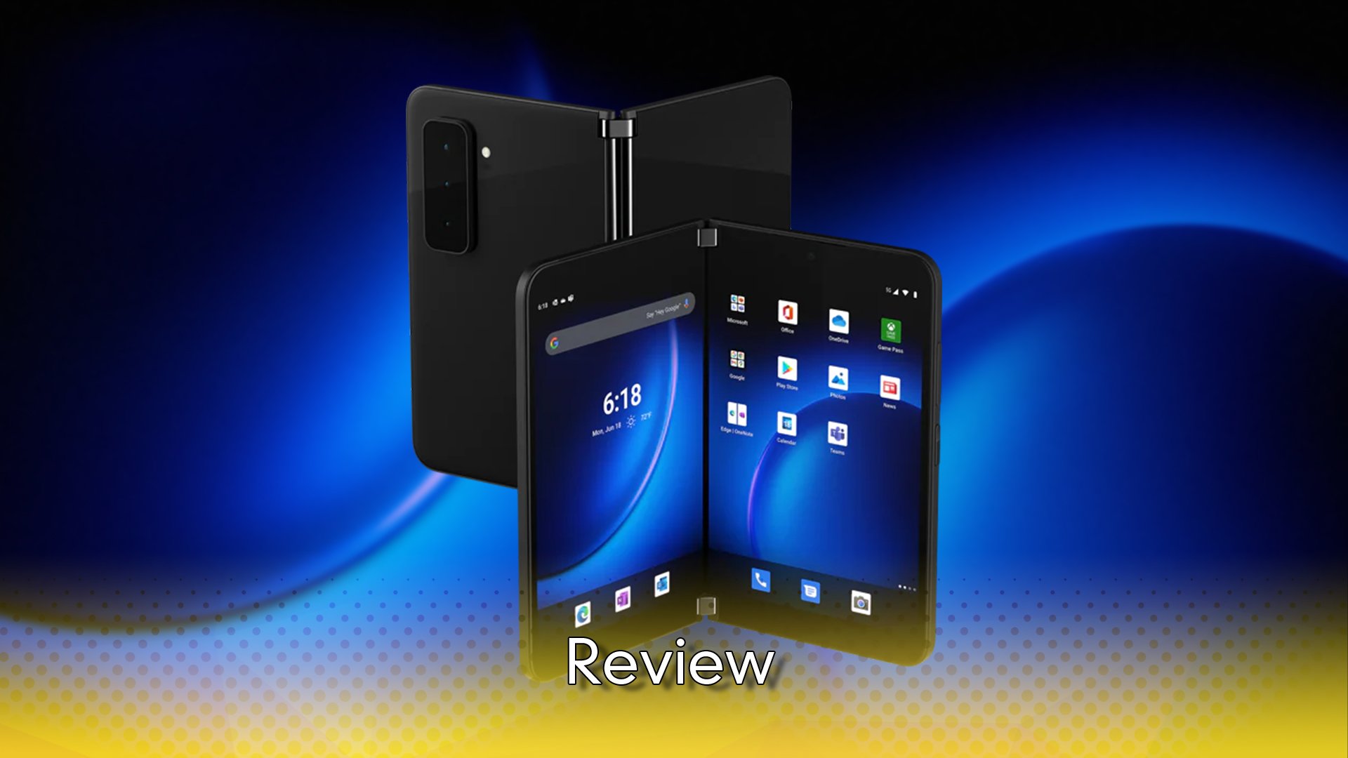
Ten years after that massive shift, phone companies are slowly but surely starting to innovate and experiment with form factor. We’ve seen things like the Microsoft Surface Duo trying to find a way to make a dual-screen experience work, and the shocking return of the Razr — though that one is not without its issues. No company, however, has invested more into doing new things in the smartphone space than Samsung, and through iteration and ideation, the Samsung Galaxy Z Flip4 is the flip phone for the modern age, pristine and perfected.
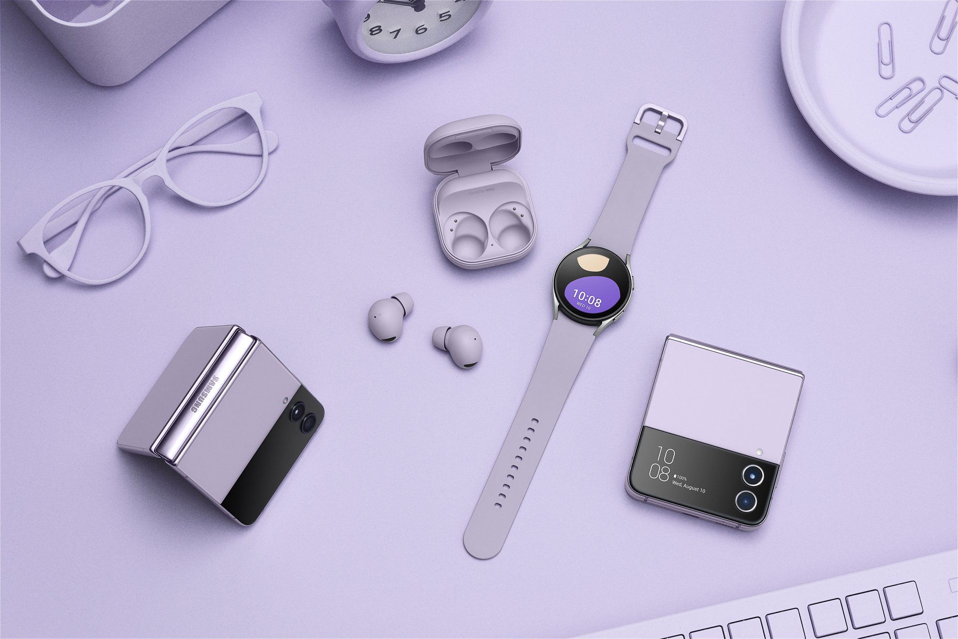
Let’s start with the tactile feel of the phone, because in a flip phone, that’s what matters most. Honestly, after having used candybar form factors for over a decade now, the idea of folding my phone in half was genuinely a shocking experience for me. It felt so deeply wrong… like I was going to break it. But Samsung’s engineering has made for a really fascinating experience in overcoming that, because the whole thing feels so damn solid. While my brain couldn’t get past the fear of breaking it, in the hand it was obvious from the first moment that it just wasn’t going to happen. It’s solid and satisfying, and while I can’t speak to how durable it is in the long-term, I can’t deny that it gives the feeling that it’ll last a long long time.
You might think that having a screen that folds in half might lead to some sort of drawbacks in terms of colour clarity or brightness on the display, but I didn’t find that to be the case, either. It looked incredibly sharp, incredibly vivid, and stood up in even the brightest of daylight conditions. It wasn’t quite as bright as my aging Galaxy S20+, but there was never a moment I struggled to see it.
The display itself is wonderful too, about the same height as my S20+, but about 20% narrower. That makes for a very tall, very narrow display, but there’s definitely benefits to that, and it makes one-handed typing a lot easier. There is a small bump in the screen where the device folds, and you can feel it when you run your finger over it, but it’s very barely visible, and after a little while it just fades into the background and you barely notice it – visually or physically – anymore.
Once it’s folded, you’ll find that it easily fits into just about any pocket of any size, and the cover display does enough of a good job to be worth the trade-off of having to unfold when you want to check something out properly. Honestly, I wish the cover display was better, however. As it stands, it works more or less like a smartwatch would, offering a few little applets that let you check and quickly respond to messages… but I already have a smartwatch, so why do I need this, too?
There doesn’t appear to be any third party developer support for the cover display, either, which is a little bit disappointing, and I’m not sure if that’s because there’s no API or if it’s just such a niche device in the greater market that most developers won’t bother with it. I’m also not sure why it’s so detached from the rest of the operating system — take, for example, Discord. When I get a message there, if my phone is open I can send a quick response from the notifications panel that’s usually pretty solid and content-aware, or I can mark it as read so I don’t have it clogging up my notifications. The cover display, on the other hand, doesn’t let me mark it as read, and the quick responses seem to be canned responses that aren’t reactive to what was actually said. It’s not a big issue by any means, but it would’ve been nice if the notifications aspect of the cover display was identical to the notifications panel. Maybe a future update can fix this.
It’s also not exactly what I would call “great” for viewing video content. The tall, narrow screen is extremely far off from a standard 16:9 aspect ratio, so you’re almost always going to be dealing with huge black bars to the sides of the content. That said, movies are almost the right fit for the screen’s length when held horizontally, and the Flip4 does support HDR content on apps like Netflix, so that’s a really great viewing experience if you’re into watching movies on your phone. I prefer watching on my TV, but it’s nice to have the option there.
In terms of software, the Flip4 does do some somewhat interesting things to make the flipping part of the phone a lot more useful than just compactness. There’s an option called “flex mode”, which basically splits the screen in two, and depending on the app that can mean different things. In something like the camera app, for example, the preview of what you’re trying to shoot flies up to the top half of the phone, while all the controls move to the bottom. That means you can set the phone down while half-folded, and use it as its own tripod of sorts, while having easy access to both the controls and the preview. You can even half-flip it and hold it sideways, kind of like a mid-2000’s camcorder, to take video, which feels surprisingly natural and would likely be even better with a case that had a strap on it.
Other apps don’t fare all that much better with flex mode. YouTube pushes the video to the top half while moving the description, comments, and suggestions to the bottom half, which seems fine on the surface til you realise that there’s really not a lot of utility in that. It exists just because it does. There’s also a forced flex mode you can turn on for apps that don’t have actual settings for it, but all it does is compress the app down to the top screen and give you a little mouse cursor to control from the bottom screen. I’m sure there’s probably an app somewhere that might benefit from that, but I sure as hell don’t know what it would be.
The internal hardware on offer in the Flip4 is fantastic, at least. The latest and greatest processor, a pretty decent battery life, and a surprisingly nice camera. Now, that last one certainly isn’t going to be winning any photography awards, but the photos it takes are vibrant and vivid, with maybe a little more saturation than necessary… but I’ve struggled to ever take a bad photo with it because of that. I get the feeling that a lot of what’s going on here is some fancy post-processing by Samsung’s photo programming wizards, but if the end result is the same, I don’t really care so much how we get there.
I have a few other small complaints that don’t amount much to anything but are probably worth a mention nonetheless. The phone body itself is incredibly slippery, to the point where putting it on anything that isn’t a perfectly flat surface will almost certainly see it sliding off — something a case could fix, and certainly not unique to the Flip4. I also don’t extremely love the pre-applied screen protector that is apparently pretty essential to the integrity of the display. It’s fine, I guess, but when you’re used to scrolling on glass, scrolling on plastic instead is a bit funky. And lastly, it’s a huge dust magnet, collecting pocket lint and environmental dust in all its nooks and crannies. I do worry a little bit about the longevity of the hinge because of that, since it’s not rated for dust protection, but the main issue is with it collecting on and around the screen, constantly forcing me to wipe it down. It’s annoying, but far from a dealbreaker.
In an age where innovation seemed to have died in the smartphone space, Samsung’s Galaxy Z Flip4 is a breath of fresh air. It’s not perfect by any means, and there’s certainly drawbacks to its form factor and execution, but it’s far and away the closest anyone has gotten to reinventing the wheel in a long long time.
The Score
8.0
Review unit provided by Samsung
The Pros
+Solidly built and extremely satisfying to open and close
+Software additions make the hardware work at its best
+Takes incredibly nice photos
The Cons
-The cover display is a little bit underwhelming
-Not all flex mode features are useful
-Screen aspect ratio isn’t great for most visual content


